Taa-DAAA!
O.k. enough is quite enough here already. I’ve been pushing pixels, fiddling with this and tweaking that for the past many weeks, til my baby-blues have verily crossed ! Enough. This is it dear readers…
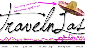
Welcome to the NEW TravelnLass hovel!
Actually there’s little I like better than whittling digital eye-candy, and I had great fun playing here for hours on end. The tricky part was moving nearly 200 chunks of TL blather (posts) from the Blogger platform to the WordPress platform, and… unveiling the new digs seamlessly via pointing my travelnlass.com domain from one corner of the wwwebosphere to another. Indeed, once I changed the nameservers it was holding-my-breath-for-up-to-72hrs time as TPTB (the invisible fingers of the www) “propagated” the whole shebang that you see here now.
In short, if you’re reading this, then HOORAY! It all somehow fell sweetly into place – yay!
Now then, lots ‘n LOTS of changes here at TL. Still the same content (i.e. the fevered ramblings of a nomadic expat teaching youknowwhat in “some g-forsaken rice paddy” here in Asia. But I’ve rearranged the furniture and now have a most versatile theme that I can play with to my heart’s content.
The menus remain pretty much the same, though I now have sweet pulldowns where I’ve stashed links to all the posts for x, y and z country, as well as a new “Potluck” category where I’ve tucked links to the loose end (though nonetheless beloved) strays (like my “Catching Up” series, “The Great Leap” FAQ, “Geocaching”, the “Random Photo Memory” corner, etc.) And don’t forget – you can always “Search” for whatever pops into your head up there on the menu to the right of the “Gallery”.
Speaking of which (i.e. the Gallery) – I searched far and wide for a decent gallery widget that suited the many (20+ countries of pics and counting) images I’ve amassed in my travels. But nothing tickled my toes, til… I was skyping with my dear Blog Brilliantly guru in Mexico one morning (her night) when she calmly pointed out that… “Uh, why not simply link the Gallery to your lovely Smug Mug site, Dyanne?” Well DUH! Yes indeedy, but of COURSE! So that’s what I’ve done – if you click on the “Gallery” menu above it will swiftly transport you to my “Through the Eyes of TravelnLass” site where you can gawk at ALL my images in one sweet place.
Then there’s those new bitty custom social icons (g-knows the digital whittling there) on the right, plus…
Please, please PLEASE click on that new “Subscribe by Email” widget in the sidebar, so you don’t miss a single post. I cross-my-heart-promise not to load your precious email with spam – simply a post or two each week is about all I can muster anyway.
Oh, then there’s a muchly expanded “About” me page – with a link to my recently scribbled “43 Random Things You Might Not Know About Me” (which I’m told makes for some interesting reading, nay might give you a chuckle).
Enough for now. Do please comment on what you think of the new TL design, and especially – DO report any techno problems you might have with it.


 Off-the-beaten-path travel is my passion, and I’ve always lived life “like a kid in a candy store” – eager to sample as many flavors as I can. Indeed, my life motto has long been:


Beautiful! But I did notice that I haven’t gotten email notifications in a while and then came to the site and saw that you have been posting. So something got lost in the transition. But then when I tried to sign up again, it said my email address has already been registered… so… ?
Oh dear. No doubt some hiccup when I transferred the site to WP? Were you subscribed via email or RSS?
Congratulations and welcome to wordpress! I really like the new design; it all fits together well and creates a coherent brand message, which is something I (obviously) need to work on. I have to admit, I did cringe a little when I saw all the ‘ing’ to ‘n’ abbreviations in the menu, but that’s just an instinctual reaction to any kind of misspelling; obviously it’s intentional in this case and I actually think it’s clever and it works.
One small thing I noticed: on smaller screens (in my case an ipod touch), everything resizes well except for the header, which stays the same size. When I scroll down, the foreground loads choppily, i.e. only the background is visible for a second or two before the foreground begins showing up in small chunks. I’m not sure if that’s a problem with the site, though, or if my internet connection was just being difficult.
Thanks Daniel, and yes I’m still getting used to wp – lots more options (than blogger) but that (allegedly) WYSIWYG editor is most definitely WYSI-NOT-WYG – ugh! That and… wp likes to tinker with my code – slaps my hands just for daring to drop in a simple
tag – geesh!
And that “n” thing – ’twas the same on the old site – and only b/c the domain is travelnlass (i.e. travelinglass wasn’t available). But in retrospect, I rather favor the “traveln…” I mean, “travelinglass” looks like “travelin GLASS”, and besides, nobody actually says “traveliiiiiing”, yes? 😉
Oh and that mobile thing. Yes, it’s supposedly a “responsive” theme, but… yes, I too tried it on my iPhone and it’s all wonky there. ;( I intend to pester the developer, but I’m far too busy prepping for Nepal and beyond just now.
Yay! It looks awesome. So very Vietnam! I love the lush colour of the rice paddy and the colours you’ve tied into the theme. All your hard work has resulted in an excellent effect!
A couple of wiggles viewing it on my teeny netbook though: it’s a resizeable theme right? I’ll send you a screenshot of issue.
Plus it’s so much easier to comment now instead of choosing which profile to use to sign in!
Thanks Ruth, glad you like it, and yes I think the new comment gizmo is much more friendly now.
Yes, it’s suppose to be a “responsive” theme, so do send me a screenshot of what you get on your netbook. It looks fine on my little netbook, but I just checked my iPhone and… it sucks big time on that – ack! ;(
Luvit Dyanne. Colorful. Like the way you did the categories (hmmmm).
Glad you like it Graefyl. When I started it, I actually favored more monochromatic, minimalist sites like yours. But then I thought “rice paddy” and from there… the design pretty much created itself! ;;)